 PHOTO: REGGIE MORROW
In addition to sign painting, lettering, type design, typography, and logo design, John Downer has also mastered the art of glass gilding. Watch him explain the process at http://vimeo.com/9555169.
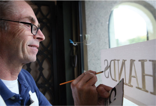
PHOTO: REGGIE MORROW
In addition to sign painting, lettering, type design, typography, and logo design, John Downer has also mastered the art of glass gilding. Watch him explain the process at http://vimeo.com/9555169.
Even if you haven’t met John Downer, you’ve likely seen his work–on business signs, in supermarket tabloids, and now, in your iBook.
Last winter, Apple updated its iBook app to include a typeface designed by Downer, a renowned sign painter and typographer. Readers can now choose his Iowan Old Style as the font for electronic books on the iPad or iPhone. The text family, first published in 1991, was influenced by modern interpretations of Italian Renaissance types, as well as classical inscriptional lettering and hand-lettered signs found in eastern Iowa.
Downer, 74MA, 76MFA, began painting signs in high school and within a year began applying his skill to advertise specials for his parents’ grocery store. Now drawing on more than 40 years of experience in lettering, he finds inspiration in faded signs on the sides of barns and in Western ghost towns between Iowa City and his hometown of Ocean Park, Washington.
Though Downer designed Iowan Old Style by hand, he now uses a Mac program to create typefaces with distinct personalities and names like Brothers, Vendetta, and Ironmonger. He sells his work to type foundries and can’t control where it ends up–only receiving a portion of the license fees. Sometimes his creations take on a life of their own, as with Roxy, whom Downer calls his "wayward daughter, a good girl gone bad." Originally developed for a women’s magazine, Roxy now haphazardly appears in the headlines of the National Examiner, on toilet paper packaging, and on bottles of generic medicine.
Downer has worked on everything from Hancher show cards to the Chevron logo, but one of his biggest projects involved creating signs for the Paris Las Vegas Hotel and Casino. For an authentic look, he referred to 100-year-old photos of Paris street scenes and sketches of signs he discovered on trips to France in the 1980s and ’90s. To create a wall sign that read "post no bills" in French, he used cigarette ashes, paint thinner, and turpentine to give the lettering a time-worn appearance.
Downer says that, unlike other artistic endeavors, type design is "an invisible art," where the objective is for each individual letter to escape notice. Few sign makers design their own letters or complete apprenticeships anymore, so the Iowa City artist regularly holds lectures around the world to pass his rare expertise down to the next generation. It’s his way of ensuring that the "invisible art" doesn’t also become a lost one.