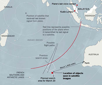
Superimposed on the vast blue-gray expanse of the Indian Ocean and the small areas of encroaching land, three red dots and a few words map out a mystery: "Kuala Lumpur." "Plane's last voice contact." "Location of objects seen in satellite images."
The New York Times created the simple map this past March as a way to bring perspective to its coverage of missing Malaysian Airlines' Flight 370. One of hundreds of maps generated by media and government agencies to help inform the public or direct search operations, the image accomplished what lengthy articles and press briefings failed to do. It showed with chilling clarity the scale and difficulty of attempts to find a plane that disappeared somewhere in the watery void between Kuala Lumpur and Beijing.
 MAP GRAPHIC: NEW YORK TIMES
This map depicting the search for a missing airliner shows that a picture can be worth a thousand words in terms of bringing clarity to a complex subject.
Designed on a computer, using digital software and data transmitted by satellites, such modern products represent the latest incarnation of an ancient, universal tradition. In every age and culture, maps have helped people understand, explore, and reflect upon their world. Whether crudely inscribed on pre-Christian-era Babylonian clay tablets or rendered in 3D animation on an iPad, they chart not only physical territory, but also history, culture, social progress, and the inner terrain of human beliefs and biases.
On the University of Iowa campus, faculty and staff from various disciplines study how the art and science of mapping has evolved with time and technology. Housed on the third floor of the Main Library and available to faculty, students, and the public, the UI Map Collection encompasses some 250,000 sheet maps spanning 800 years of history�from medieval Europe to Lewis and Clark's exploration of the American West to Nazi propaganda maps from World War II.
At their most basic, maps represent an attempt to capture information�to provide a snapshot of time and space. They provide directions, data, and information about terrain for world explorers, invading armies, day hikers, and families on summer road trips. But in surprising ways, maps also reveal illuminating details about their makers.
As Map Collections librarian Margaret Gamm opens a large box and carefully unrolls its contents across a table, the medieval world materializes in vibrant shades of red, gold, green, and blue. This reproduction of the 13th century Hereford Map presents a dazzling picture of life and beliefs in the Dark Ages. The original document, named after the English cathedral where it was discovered and is now displayed, is the oldest and largest (at about five square feet) European medieval mappa mundi, or world map.
By modern standards, it's a bizarre creation. Accurate scale and distance are nonexistent, cardinal directions are haphazard (with east at the top of the map), and place locations are determined by symbolic significance rather than geographic coordinates. So, Jerusalem�the focus of Christian faith�sits squarely at the center, while the Garden of Eden is depicted in a circle at the edge of the world. Although not geographically precise, this piece of parchment offers a primer on medieval history, climatology, politics, mythology, and religion. The map's 420 towns, 33 animals and plants, and 32 people include some real locations and landmarks, such as the Dead Sea, Constantinople, and Mount Olympus, as well as mythological and biblical references to unicorns, Jason's Golden Fleece, and Noah's Ark.
Despite its seemingly primitive qualities and inaccuracies, the Hereford Map shouldn't be dismissed simply as a poor example of cartography. Kathy Lavezzo, a UI professor of English and cultural geographer whose research includes medieval maps, says such stereotypes reveal our own ignorance about the medieval world. "The Hereford Map was intended to be used for learning," she says. "It's a visual encyclopedia."
 PHOTO: MARGARET GAMM
Mappae mundi also demonstrate the inescapably flawed nature of maps�even modern ones. By attempting to replicate three dimensions in a two-dimensional form, maps can never be 100 percent accurate. Plus, as it's impossible to fit all the available data onto a map, cartographers have to decide what to include or omit. That's when errors, deceptions, or manipulation of facts creep in. Says Lavezzo, "Despite scientific advances in cartography and knowledge of the world's geography during the Renaissance, or the recent use of GIS technology, mapmaking remains political." In fact, she adds, all maps are subjective and bear the biases of their makers to some degree: "A 20th century map of the British Empire depicts England at the center of the world, just as a medieval map shows the center of the world as Jerusalem."
Cultural biases and political messages appear throughout the UI Map Collection's march through history. In 1941, the German Library of Information in New York published a book called The War in Maps. Intended to convince the American public of the righteousness of the Nazi cause, the book rewrites history. World War I's Treaty of Versailles becomes "The Versailles Dictate," while Germany's invasion of Poland is recast as a reluctant act in response to Polish "insolence" and "unrestrained Anti-German agitation."
Another item clearly displays the bigotries of its maker and era. With its beautiful illustrations and calligraphy, the ornate 1874 "Map of the World" by E. C. Bridgman is a work of art�yet its stereotypical descriptions of ethnic or national groups present an ugly picture of the prejudices that were socially acceptable and widespread in 19th century Europe. With words that shock modern audiences, Bridgman dismisses Neapolitans as "vain and superstitious," Persians as "more tolerable than the Turks," and "Feejee Islanders" as "warlike, treacherous, and ferocious cannibals." The Swiss receive a rare glowing report: "Like all mountaineers, [they] are generally tall, robust, and sober. They are brave, faithful, highly patriotic."
As they respond to changing times and attitudes, maps reveal the impermanence of "reality." Another of Gamm's favorite items from the UI collection is a map created for 1950s American tourists visiting Cuba. For many Americans today, the Bay of Pigs conjures images of counter-revolutionaries, a fear of Communism, and a world teetering on the brink of a terrifying crisis. Yet, created a decade earlier than the failed 1961 invasion and subsequent strained U.S.-Cuba relations, the tourism map paints a much rosier picture of Havana, directing visitors to yacht clubs, casinos, and country clubs.
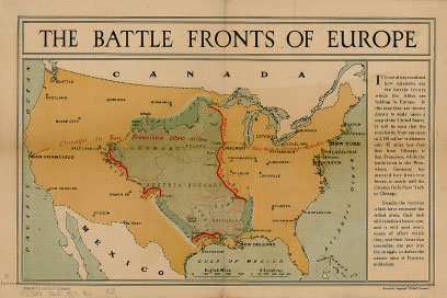
Despite such limitations in accuracy and veracity, maps can convey information better than words, providing context and comprehension at a quick glance. Designed to put World War I in perspective for Americans unfamiliar with Europe, a 1917 map in the UI collection shows the familiar shape of the United States with borders and key cities indicated in black text. But, part of the map of Europe is superimposed over the middle section, so the Baltic Sea appears in North Dakota, Turkey sits just north of New Orleans, and red lines indicate the 2,195 miles of battlefronts. Layering the geography of Germany, Poland, and Austria-Hungary over the Midwest literally brought home what was at stake in the conflict. Even though many Americans at the time had never traveled to Europe, they could realize the effort required to defend a battlefront that stretched practically from Chicago to San Francisco.
While plenty of 20th century printed maps appear in the UI collection, increasingly such documents take a digital form. In the last decade, developments in computer software and information systems have transformed the field of map-making, opening up new frontiers of knowledge. While older maps were restricted by what information could physically fit onto a sheet of paper, digital versions bring virtually boundless amounts of data to computer screens, iPads, smartphones, and in-car navigation systems. It's an exciting new world, although the pace of advances already raises legal and ethical questions about privacy, data ownership, and confidentiality.
Digital maps can zoom in and out on the world, update dynamically, and adapt to a user's needs�showing not only the way to a new city but also extra details such as local weather, traffic conditions, and restaurant reviews. To create them, today's cartographers often use geographic information systems (GIS) that capture, store, edit, display, manipulate, and analyze staggering amounts of data. Much of the data is freely available on the Internet from federal agencies like the U.S. Census Bureau and the U.S. Geological Survey. Other geographic content comes from commercial companies, the GIS community of academics and researchers, and even members of the public who share location-based photos and information via the Web.
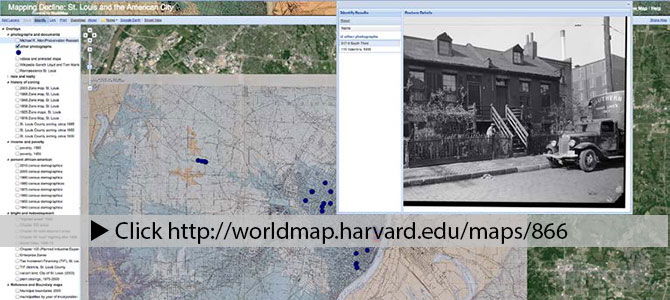
From an academic perspective, GIS is an ideal tool for locating and sharing information and collaborating with other experts. In 2008, when UI history professor Colin Gordon worked on his book Mapping Decline: St. Louis and the Fate of the American City, he created an interactive digital map using archival, demographic, and political facts and figures about the city. Over a base map of St. Louis, he applied more than 50 overlays of data�such as poverty rates, factory closings, and minority population figures�that could be presented separately or simultaneously to provide a complex, multidimensional picture. In doing so, he identified patterns and relationships between the data, such as how the loss of factories affected poverty rates.
 UI history professor Colin Gordon's multi-layered digital map of St. Louis offers dozens of choices for extra information, such as this pop-up window displaying a historic photo of a particular neighborhood.
Gordon has presented his findings to St. Louis planning groups, transportation planners, and the Equal Opportunity Housing Council, as well as fellow academics. "They're all able to go in and use the parts of the project that best fit their needs," he told the UI's online publication Iowa Now. In fact, this new approach to mapping helps people in a wide range of industries�from health care to urban planning to federal government�analyze facts and make decisions based on accurate data.
The ability to link reams of multidisciplinary information to a geographic place has produced a surge of "digital humanities" endeavors at the UI and other institutions. Among many projects, UI faculty have used GIS to create maps to better understand Civil War battles, the international impact of 17th century Dutch traders, and the effect of the 2008 floods on Iowa City and surrounding communities.
In the Department of Geographical and Sustainability Sciences, Associate Professor Kathleen Stewart researches the theory and applications of GIS, such as its role in crisis situations like severe weather or emergency events. Through "spatiotemporal information retrieval"�in other words, analyzing the data about locations that people provide through Twitter or social media�experts can track events like a tornado outbreak in real time and space. As smartphones automatically provide GPS coordinates, tweeting via an iPhone provides a kind of date- and place-stamp for information about ongoing events.
"In cases of major storms, real-time information provided by volunteers on the ground can help with 'crisis mapping' and show where emergency services are needed," says Stewart. "We can understand what's really happening where and when."
This hybrid of geography and computer science also inspires UI students, who learn that they can manipulate the new technology. Last fall, in a first-year seminar called "More than Just a Map: Beyond Google Maps," 14 freshmen created personalized maps of their life on campus. After downloading a free app and an Iowa City street plan, they highlighted their routes from dorm to classroom and then added photographs and videos they'd taken with their smartphones along the way. Stewart, who taught the seminar, explains, "Maps are becoming much more democratic in the way that anyone now can create and share them for a wide range of purposes."
With virtually everyone able to participate in cartography these days, maps have certainly come a long way since those earliest eras of clay tablets and parchments created by a select few. They've guided people to new continents and new understandings; now, they're heading into the uncharted territory of the future. However technology molds them, one thing is clear: maps will remain a fundamental part of the human experience.
More Maps
Follow the UI Map Collection's "Mapiversaries" blog here.
See examples of "storytelling" and informative maps�from the 2014 Olympics to U.S. public policy on topics like solar energy, health care, and international affairs�at this leading geotechnology company's website: here.
Explore the virtual version of the 13th century Hereford Map at here.
Discover what the future holds at Google Maps: here.
Learn more about GIS research at the UI: here.

